Introduction
Twitter and its codebase have been in the news for a while now. However, much before Twitter went through its 2022-23 transformation, another development helped take it to every type of device across the world.
Popularly known as Twitter Lite, the Twitter Progressive Web App (PWA) project started in 2015 with the goal of creating a truly “good” experience for every type of device. After an initial server-rendered POC for logged-out mobile web users, the Twitter team started working on a client-side React application for a scalable PWA in 2016. The initial wins were shared with the developer community a year later. From 2017 to 2022, Twitter Lite evolved to incorporate the latest PWA capabilities and best practices making it faster, more accessible, responsive, and capable for all. Let’s discuss the business drivers, technical changes, and lessons learned during this transformation.

Business Case
Twitter (now X) was a prominent social media app used by content creators, influencers, and consumers. As of December 2022, Twitter had 368 million monthly active users worldwide, a number that had steadily grown since 2019.
While many people worldwide access the internet using mobile devices, mobile data costs differ significantly across different countries. Mobile internet can cost anywhere between 4 cents per GB and 41$ per GB. For any product with a global audience, it must be accessible to users across this spectrum.
In 2017, making their apps easy to use for all users was a priority for Twitter, and they directed their attention to core clients, i.e., web browsers on smartphones. The initial focus was on growth markets where low-cost Android devices had been more prevalent. The strategy was to invest in an excellent cross-platform PWA experience that targeted smartphones first but could be easily distributed on other platforms when the time came.
The solution was one universal web app - a single codebase for multiple clients - that was responsive to the diverse needs of users in both mature and emerging markets.
Twitter developed this new app, branded to differentiate it on mobile as “Twitter Lite”, to deliver a more robust experience, with explicit goals for instant loading, user engagement, and lower data consumption.
- 65% increase in pages per session
- 75% increase in Tweets sent
- 20% decrease in bounce rate
A universal web app also allowed Twitter to build once and ship to everyone through a single codebase. Twitter users benefit from regular updates and consistency across platforms, providing a better Twitter experience overall.
Introducing the Twitter Lite PWA!
Twitter Lite became the default mobile web experience for all users globally in April 2017. It was designed to be fast and responsive, use less data, take up less storage space, and support push notifications and semi-offline use in modern browsers.
-
The PWA allowed Twitter to reach users on low-end devices and unreliable connections. It contributed to a nearly 75% increase in tweets sent as compared to the previous mobile web client, attracting new users who appreciated its lightweight, fast, and cost-effective nature. However, it should be noted the previous mobile web client had not been invested in for a long time.
-
Twitter Lite’s availability in the Google Play Store as a wrapped WebView, significantly increased its discoverability. It is now available in 70+ countries. As of May 2023, it has surpassed 10 million installs from the store since.
-
Shortly after, the scalable nature of the codebase also made it the perfect candidate to replace two other apps, the Android Tablet App and the Microsoft Store App, where it was branded as just “Twitter” for providing a better experience than the older unmaintained apps.
Over the years, the PWA became so successful it graduated to powering the web experience on all devices, including desktop. To provide an installed app-like experience, the team also introduced other features that enabled a seamless experience when launching the app, sharing links, or receiving notifications. After enabling Twitter Lite as the default experience for all web users in July 2019, Twitter turned off the old version of its website on June 1, 2020. What you see today when you visit Twitter.com in the browser is the installable version of the Twitter PWA.

Let’s put on our technical glasses now to look at the finer aspects of how the PWA was built.
Getting the PWA basics right
For an app to be considered a PWA, it has to meet specific requirements. The PWA checklist describes a list of these requirements. Let’s see how Twitter Lite implemented these features to tick off the items on this checklist.
Installable
You are more likely to engage with an app installed on your device than one you access on the browser. PWAs should be installable, allowing them to look, feel, and behave like installed native apps. Twitter provided different options to make Twitter Lite installable:
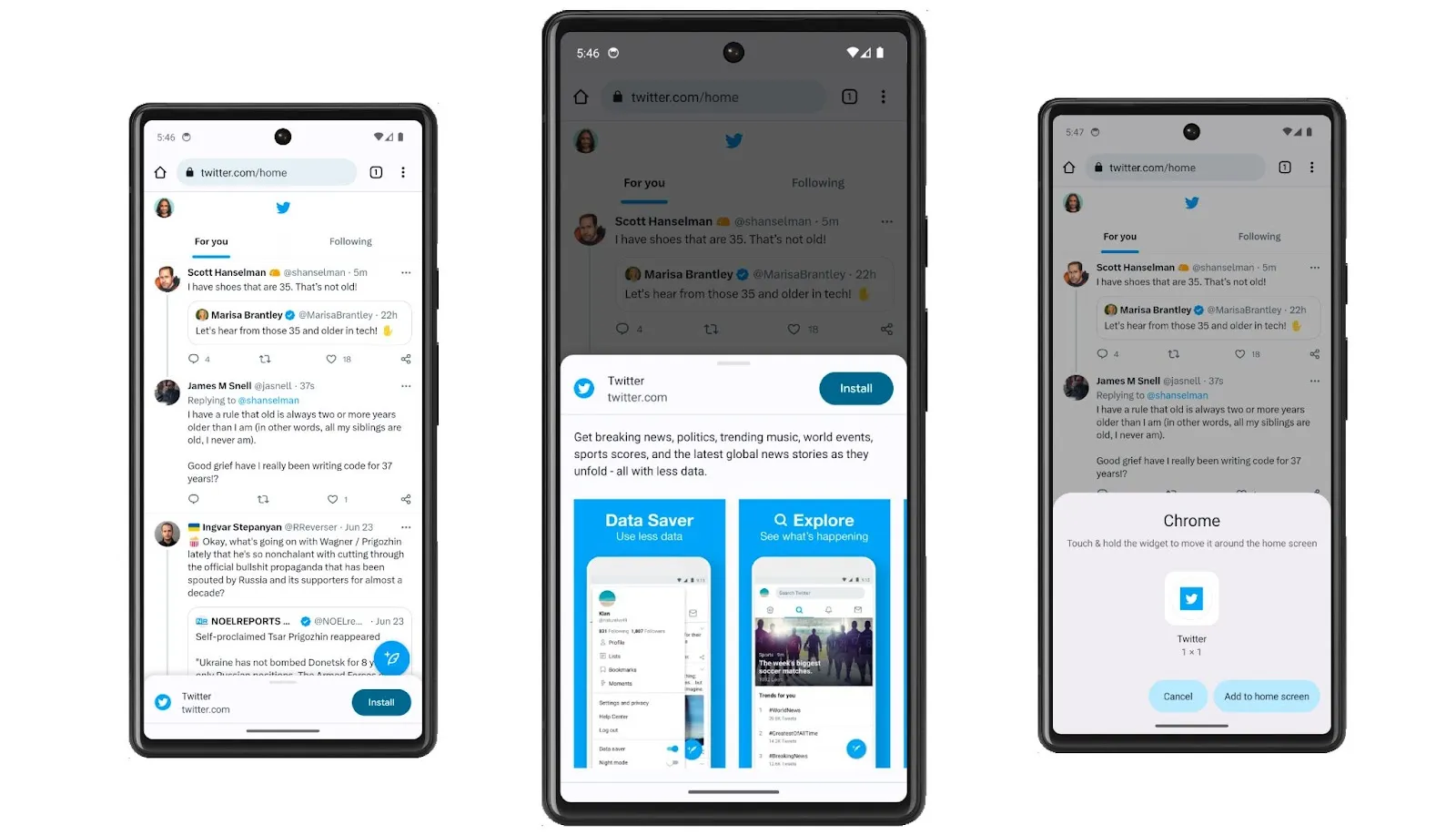
Add to Home Screen: This option, also known as browser promotion, is available when you access the app in the browser. When an app meets required browser-specific criteria, the browser provides an option to add the app icon to the home screen, allowing it to launch directly.
![]()
The web app manifest is included in PWAs to create an installable experience for its users. The manifest contains information on the app’s appearance and behavior when installed on the device. Twitter Lite included a manifest that is used to display the app’s name, description, URL, and the different icons the app should use.

Google Play Store: Twitter Lite also became available on the Play Store and could be installed and run like any native Android app. The app icon helps identify it as a Twitter app, and the app opens in its own separate window. The PWA is a wrapped WebView on Android. Compared to the 31.2MB of data that was required to install the native Android app, it consumed only 600 KB of data, making it more accessible to users with limited data plans.

Note on PWA’s for Android: Chrome recently removed the requirement for a service worker fetch handler for web apps on Android. Web app developers can now skip this step as Chrome provides the default offline experience, showing users a screen with the app’s icon, letting them know they are offline.
Listing the app in the Play Store increased the discoverability of the app and allowed Twitter to reach more people and grow its user base. They could access reviews and ratings across countries which gave the team visibility on how users perceived the app at scale and helped them find gaps in the user experience.
An exciting side-effect of accessible feedback was the requirement for dark mode. The team realized that an overwhelming number of users demanded dark mode in the app, which provided the motivation to invest in a strong theming and design system. The feature was so well-received that users asked for dark mode in the desktop app. Thanks to the common code base, this was relatively easy to enable when the desktop PWA became available.


Starts fast, Stays fast
High-performing sites engage and retain users better than poorly-performing ones. Twitter Lite emerged as a lightweight, fast, and efficient alternative to the main Twitter app, focusing on performance optimization for users on slow networks and low-end devices. In his 2017 case study on performance improvements, Paul Armstrong talks about how the team ‘made small improvements across many areas’ , that added up to give significant performance benefits. While the case study will give you a deeper understanding, let’s try to summarize the essence of these improvements here.
Code Splitting and Bundle Splitting
Sites that serve large JavaScript files can take a long time to load, especially for mobile users. When building Twitter Lite, the team employed route-based code and bundle-splitting techniques to minimize the initial JavaScript payload. By breaking the code into smaller chunks, the application only loaded the required functionality for a given view, reducing the amount of data that needs to be transferred and parsed on the initial load.
After code splitting, the Time To Interactive (TTI) was reduced to almost half its previous value as measured on Chrome’s Lighthouse.
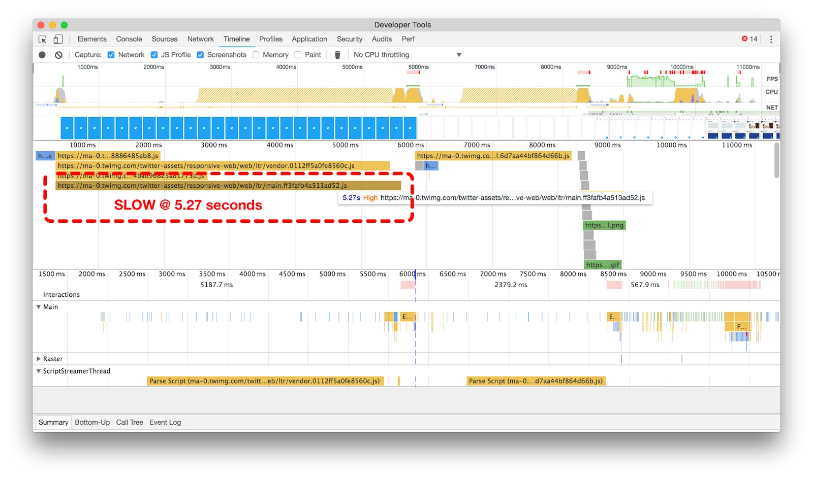
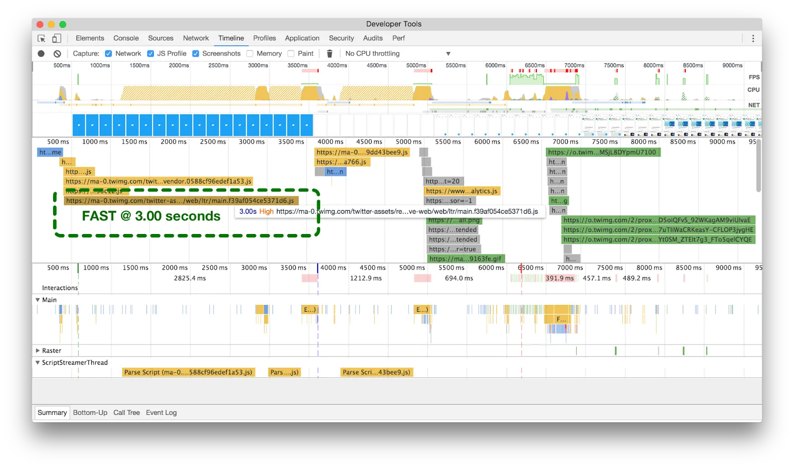

The initial strategy for code/bundle splitting was to have ~40 on-demand chunks lazy-loaded using the PRPL patterns that were otherwise amortized as a user navigated through the app. When Webpack released the SplitChunksPlugin, the strategy was tweaked to create the following required chunks as a base:
- runtime (Webpack): This would be rendered as inline script content in the HTML to avoid having an extra network round trip.
- vendor: Third-party code that came in via node_modules and was used in over 4 bundles.
- shared: Internal shared code that was used in more than 4 bundles.
- main: The entry to the react application. This included the React render call, initial user fetching, hydration, and router logic.
- i18n: Internationalization and translations for the user’s and browser’s current language settings
All other code was page or view-specific.
This system of grouping bundles helped in code splitting and helped the team manage and organize code effectively for an application of this scale.
Over the years, other enhancements further helped with managing bundle sizes. Each bundle was created in “legacy” and “modern” versions based on the browserslist. This allowed the team to aggressively prune dependencies, use ES5 native features, and shave a big chunk of the load time on the newer browsers used by most users.
Build tracker
While the code-splitting enhancements proved fantastic, the team had to ensure they stayed that way as new code was introduced or changed.
In massive projects such as Twitter, it’s easy to accidentally pull in something on the client that was meant for the server. Alternatively, someone could introduce a large include that may need tree-shaking. The team still recollects a specific issue that happened a couple of times when importing a large portion of the application code into the service worker resulted in its size going up from <100 KBs to many times that. This crashed both the service worker and the application. Such issues became easy to catch with the build tracker.
Sometime after the first few releases of Twitter Lite, Paul Armstrong started working on Build-Tracker - a set of tools to track the size of your build artifacts over time and introduced it at Twitter. The build tracker allows you to configure performance budgets for your codebase. The tool proved crucial in maintaining the bundle size because it integrated with the CI system and flagged large changes.
Based on the budgets configured, the build-tracker was able to warn or fail pull requests when assets failed the budgets and proved itself to be a savior on multiple occasions. Differences in every single pull request and deployment were reported as a way to monitor and catch accidents ahead. In Paul’s words - “By setting a budget for tracking, and reporting build size deltas, we’ve prevented changes that would have increased metrics like TTI, TTFMC and Time to First Tweet by over 100%.”
![]()
- Build tracker comments on PRs with a detailed breakdown of changes.
- Engineers use this info when reviewing PRs.
- Build tracker logs the size of all production builds.
Default data savings
Twitter users in emerging markets typically use low-end devices or unreliable connections. The cost of using the app can grow depending on the amount of data downloaded on limited data connections. Twitter Lite embraced methods to use less data by default via its data saver mode, serving smaller media resources and relying on cached data as much as possible.

The data saver mode allowed users to control when Twitter Lite downloads media assets, further conserving mobile data. Images and videos are blurred until they’re tapped.

PRPL
While route-based chunking of code helps faster first loads in Twitter Lite, using the PRPL (Push, Render, Pre-cache, and Lazy-load) pattern truly enabled Twitter Lite to start fast and stay fast. PRPL is a pattern for structuring and serving Progressive Web Apps (PWAs), with an emphasis on the performance of app delivery and launch.
One of the fundamental principles of PRPL is to prioritize loading the code that a user will use immediately and defer loading other code until the app/user is idle. Twitter Lite followed this to push/preload its most important resources and render the initial route as soon as possible.
Push/Preload/Prefetch
DNS prefetch is a browser resource hint that tells a browser to make a DNS lookup for a domain before the browser has determined that it needs to be made. This can improve performance because when the browser does need to make a request for a resource, the DNS lookup for that domain has already occurred.
The app saw an 18% improvement in start-up time using this DNS prefetching technique. This technique resolves domain names before a user tries to follow a link by using the computer’s standard DNS resolution mechanism.

Twitter Lite adopted the Preload directive (link rel=preload) to enable the browser to discover resources sooner and request them without blocking the document’s onload event. Preload can decouple the load event from the script parse time and move the download start time of an asset closer to the initial request. The app saw a 36% improvement in load time after using preload.

Later the team experimented with using the preload pattern for off-site navigation, such as loading ads or cards. The preload was triggered when a user hovered or lingered on a third-party card or ad. The feature could either preload the DNS or even the full page to make the next possible hop faster. For example, in the following example, hovering over the Peacock card might pre-resolve DNS or fetch the target page.

Render
A tweet may contain different elements, such as text, links, and media. This made rendering an infinite Twitter timeline a complex and expensive process. Twitter Lite broke up the rendering work using a virtualized list component.
The component leveraged the Intersection Observer API and eagerly loaded only a little content than was needed to fill the visible viewport (~2.5x more than the height of the viewport, to avoid flashes of blank content when scrolling quickly). It incrementally rendered items over multiple frames using the requestAnimationFrame API and preserved scroll position across screens.
The app also uses the requestIdleCallback API to further improve perceived performance by deferring non-critical JS loading of images to idle periods. The requestIdleCallback method schedules work when there is free time at the end of a frame or when the user is inactive. This alone was responsible for a 4x improvement to render performance.
Pre-cache with Service Workers
Service workers act as a proxy to pre-cache existing views, feed updates, notifications, messages, settings, and even the application shell on the first load. They can fetch assets directly from the cache rather than the server on repeat visits. This helps to dramatically reduce the loading time for successive page loads. As a result, Twitter Lite boots up in under 3 seconds when a user returns to the PWA, even on slow mobile devices or networks.


Above we can see the Twitter application shell loading instantly on a spotty network connection. This is thanks to the UI shell being pre-cached so it can load from disk.
While service workers can help reduce the load time for subsequent visits, the initial registration of the service worker could be a slow process causing network contention as it installs the current version and requests assets to be pre-cached. Registering your service worker immediately on page load can block all other network requests. On the other hand, deferring the service worker registration allows the initial page load to make required network requests without getting blocked due to the concurrent connection limit of the browser. This is what the Twitter Lite team did to optimize the service worker registration.
Lazy-load
While the initial load only renders resources needed for the visible screen, the entire app is loaded progressively. The application incorporated lazy loading to defer the loading of non-critical images and media until they are needed. This reduces the amount of data that needs to be loaded upfront and improves overall performance, particularly on slow networks.
While lazy-loading can improve performance, real-world conditions and device limitations could affect any potential gains that lazy-loading had to offer. For lazy-loading on a continuous timeline, it was essential to carefully optimize the number of assets that could be batched together before lazy loading them to avoid network contention among different requests.
Some browser versions and devices could quickly get overloaded with network requests, reducing performance on the main thread and the loading of immediately necessary items in favor of the lazy loads in the background. To manage these constraints, the Twitter app used a batch size of 10 assets with the background lazy-load starting 10 seconds after page-load.
Optimizing Media and Images
Sharing of images was introduced to Twitter in 2014. Loading images can be resource intensive, especially on slow/expensive connections. The image pipeline had to be optimized for the Twitter Lite PWA to be fast and use less data.
Twitter Lite utilizes the following image optimization techniques to reduce the size of images without sacrificing visual quality.
-
Twitter introduced Progressive JPEGs to improve the perceived loading performance of images. They started shipping Progressive JPEGs with a baseline quality of 85%. This improved the time it took for users to go from a blank screen to something with content. For users in India and Indonesia, there was a 90x improvement between loading a PNG and a progressive first scan of low-quality JPEG.
-
The human eye cannot distinguish between image pixel densities beyond the retina density. Twitter caps the image fidelity on ultra-high-resolution devices. As a result, timeline images on these devices could load roughly 33% faster while using 1/3rd less data and with no visible quality change.
![]()

- The app incorporated lazy loading and decoding to defer the loading of non-critical images and media until they are needed. This reduces the amount of data that needs to be loaded upfront and improves overall performance, particularly on slow networks. Consider the following raster timeline in Chrome Developer Tools to understand how compressed images improved performance.
- To gauge the performance benefits of using smaller images, we can use the Raster timeline in Chrome Developer Tools. The recording on the left below demonstrates that decoding a single image took upwards of 300ms before we reduced image sizes. This is the time it takes to process an image after it’s downloaded but before it’s displayed on the webpage.
- While aiming for a 60 frames-per-second (fps) rendering standard during page scrolling, we aim to limit as much processing as possible to under 16.667ms (equivalent to 1 frame). However, we’re currently needing about 18 frames to render a single image into the viewport, which is excessive. An interesting point to observe in the timeline is that the Main timeline is largely obstructed until the image has completed decoding (evident by the whitespace). This indicates we’re encountering a significant performance issue.
- Large images (on the left) can hinder the main thread for up to 18 frames. In contrast, small images (on the right) only require roughly 1 frame. Click or tap to zoom.
- Post our image size reduction (illustrated above, on the right), the decoding of our largest images is now just slightly over a single frame.


- Along with data saver mode and lazy loading for rendering images and media, Twitter also introduced on-device resizing and compression for the images that users shared from their phones in low-bandwidth conditions. The goal was to cap the time it would take to upload a tweet with an image. The Network Information API was used to determine the connection type and resize/compress the images required so that they could be uploaded quickly, even on slow connections. This significantly increased the media shared and led to a 9.5% reduction in canceled photo uploads overall.

-
Further detail: On the server, Twitter compresses images to 85% JPG and max edge of 4096px. But what about phone camera images so big you might not be able to easily upload them on a slow connection? On the client, they check if images appear above a threshold (using pixels per byte). If so, draw it to canvas and output at 85% JPEG to see if they improved size Often this can decrease phone captured images from 4MB to 500KB with indiscernible quality differences. When they detect a slow 3G or 2G connection, they might go even further and cap the size below 150 KB and rescale to get below that cap. This led to a 9.5% reduction in canceled photo uploads overall. On iOS andAndroid, Twitter always upload as JPEG 85% and if there is a failure during upload, they cut the image resolution down to increase chances for upload success.
-
Digital art communities such as pixel artists’ growth have been huge. These artists don’t need more than 256 colors often as they wish to share high-quality versions of their artwork but not full resolution as they still want to sell or license them. Pixel art needs to be high-quality but not high-res. To support lossless image quality for artwork, images that are uploaded in PNG-8 on Twitter were left untouched, transparency included. This means you could have up to 256 colors in a PNG-8 and Twitter would keep the image as is. PNG-8 helps avoid folks turning their PNG-24’s into often larger sized PNG-32’s. This change led to images that are 4-8x smaller in size overall which is a huge win.

- To optimize video playback, Twitter Lite employed adaptive bitrate streaming, which dynamically adjusts the quality of the video stream based on the user’s network conditions. This ensures smooth playback even on slower connections, reducing buffering and providing a better user experience.
Reducing Jank
Jank is when your web pages appear sluggish as you scroll down. This is because the browser cannot match the device’s refresh rate to change the frames as new data loads and sections of the screen refresh.
Twitter had an infinitely scrolling timeline long before Twitter Lite. Previously, Twitter used the react-waypoint component to implement this feature. On every scroll event, the component would calculate many different heights, widths, and positions of elements to determine your current scroll position, how far from each end you are, and which direction you’re going. These calculations required extra work by the browser, causing jank.
To overcome the issue, the Twitter team developed a new infinite scrolling component called VirtualScroller. The new component helped them calculate what slice of Tweets is being rendered into a timeline at any given time. It could perform height calculations, render tweets off-screen, and then re-position them with CSS absolute positioning.
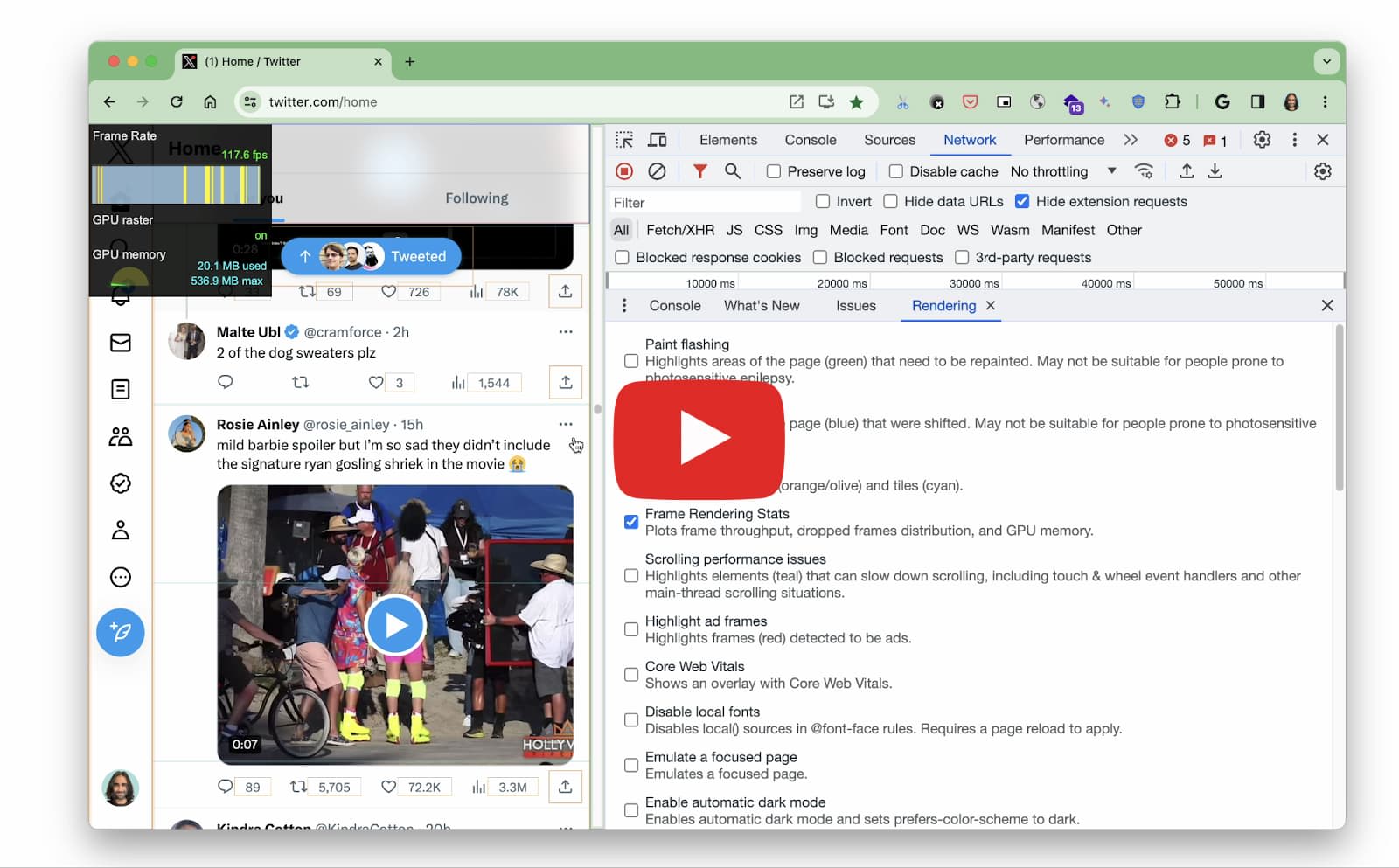
The virtualized list component in action on the Twitter timeline. With Chrome DevTools > Frame Rendering Stats on we can see a relatively high frame rate achieved on scroll.
This reduced the flashing of content and avoided multiple re-renders of the same content, thus eliminating jank. Getting to a seamless scrolling experience took many iterations and a lot of effort, which were amortized, as none of the other implementations came close to performing as well as the Twitter VirtualScroller.


Optimizing i18n
Twitter Lite was designed for international audiences and supported multiple languages right from the beginning. However, the team found that their i18n(internationalization) pipeline, built using the globalize-webpack-plugin and react-globalize-webpack-plugin, made the app slow and inefficient.
Each app build included i18n strings invalidating file hashes across the app. The hashes generated were different even when the files were the same and of the same size. Build time was further affected because the team had to build separate bundles for Left to Right (LTR) and Right to Left (RTL, e.g., Arabic) text. While the build process was slow for developers, this design also affected end users. Each time the app was deployed in production, the user’s cache was invalidated. Service Workers had to redownload static content the next time the user accessed the app.
The Twitter team undertook a complete rewrite of their i18n build pipeline. The following were the most significant changes.
- All CSS modules were replaced with react-native-web StyleSheets. Since react-native-web has A+ support for i18n and directionality, the team was able to drop the separate build for LTR/RTL text.
- Translation strings that were not required on the initial page load (e.g., in the emoji picker) were lazy-loaded. This accounted for a ~50K reduction from the main bundle.
- After the change, I18n bundles were statically hashed instead of dynamically hashed, speeding up the execution of runtime parsing and interpolation of these bundles.
Developer experience was greatly improved as there was an overall improvement of 6-7 minutes (>50%) in build times after these changes.
| Before | After |
|---|---|
 |  |
User experience was also improved with a 30kB reduction in overall bundle size and 80% faster JS exec from the new i18n pipeline.


Although invisible to others, the i18n change was a win-win for all.
Works in any browser
Twitter Lite was built progressively with device and browser disparities in mind considering various factors such as network conditions, operating systems, browser versions, and internationalization. The team adopted an incremental enhancement strategy, customizing the experience based on each device’s unique properties. They started with the mobile logged-in experience and gradually replaced the legacy desktop apps with the PWA.
Features like the Service Worker were not available in all browsers when the app was initially launched. Service workers were used for push notifications, to pre-cache application assets, and more if available on a browser.
Twitter Lite used an incremental approach, starting with a custom offline page presented whenever a network connection wasn’t available. This also helped them meet one of the basic PWA requirements. Next, they transitioned to offline caching of static resources like CSS, images, and JavaScript bundles to speed up repeat visits. Lastly, they added support for offline caching of their application shell.
Responsive to any screen size
The app was enhanced progressively for different devices to cater to the diverse needs of users on these devices. Each device is unique in the way users access the app through the device. There is a standard set of parameters where app usage may differ based on the type of device. For example,
- Screen size may be broad or narrow screen as in laptops vs. smartphones.
- Common input types may be keyboard, mouse, or touchscreen. (Desktops vs. tablets)
- Network types may be wireless (more common with desktops) and laptops or GSM (commonly used on the go with phones but less reliable).
- Operating systems could be Android, iOS, Windows, etc.
Any given device can be characterized by a combination of these values that a PWA must support. Twitter used React for developing Twitter Lite, enabling the reusability of code components and simplifying the process of altering functionality based on device parameters. This approach allowed for efficient progressive enhancement and better code maintainability.
Twitter Lite’s component-based design approach facilitates the creation of responsive experiences tailored to individual devices and their properties. UI components help to establish a shared vocabulary between design and engineering that encourages rapid iteration and reuse of existing building blocks.
The PWA incorporated responsive design principles for different screen sizes and input methods. They use Flexbox for layout. As a result, UI elements are automatically arranged depending on viewport size. Examples include adapting overflow menus, displaying related content on larger screens, and reconfiguring navigation based on user feedback.
The timeline is usually the homepage on all devices. The team applied different layouts per route for the pages. On a widescreen, two routes could be displayed side-by-side in a parent-child view, whereas only one would be displayed on mobile. For example, the sidebars are shown with the timeline on a desktop, while only the timeline appears on a mobile screen.

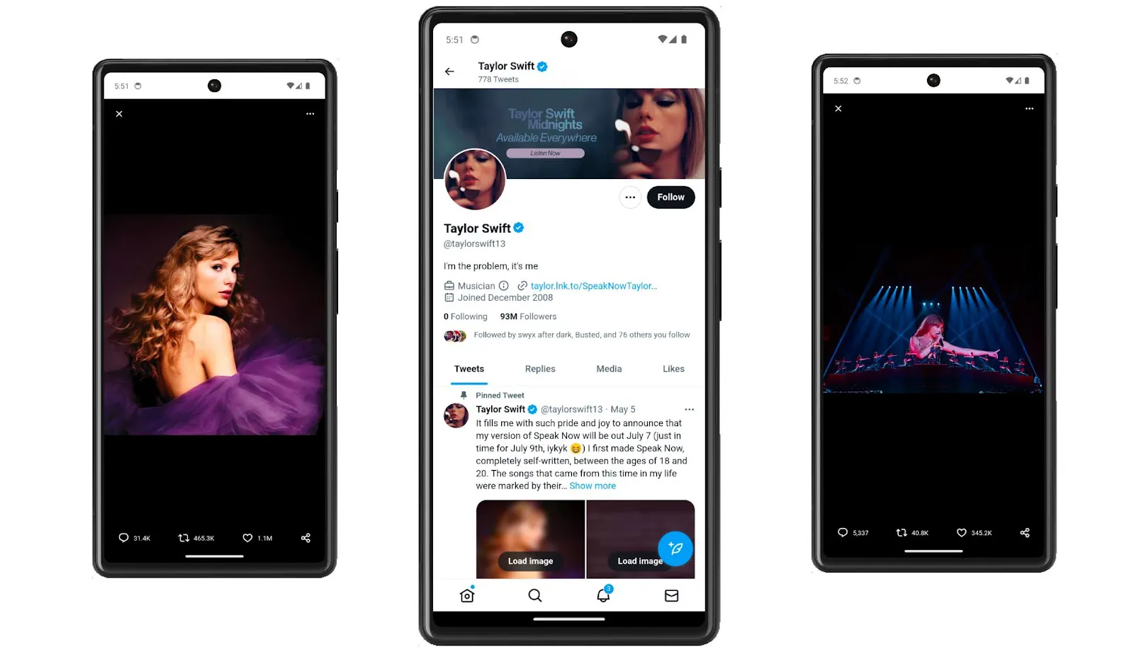
Twitter built some remarkable components demonstrating how creating a responsive experience for all your users across browsers on various devices is possible even with a single code base.
Action sheets
In Twitter, Action sheets are the menus that appear on mobile when several action options are possible. For example, when you click on share, a menu pops up and occupies the bottom half of your mobile screen. However, on a desktop, you don’t want the same component taking up half of the screen. The convention on desktop apps is to display the options dropdown closer to the position clicked. Twitter built an intelligent Action sheet component that can determine the window size to show the options either as a dropdown or as a half sheet. Each option is an ActionSheetItem comprising a link, text, and an icon. The mobile ActionSheet has a Cancel option not required on desktops where users prefer to click outside the list to cancel.
| Desktop | Mobile |
|---|---|
 |  |
Parent-Child
On desktop, web apps haveaccess to a lot of real estate that canbe utilized to show some valuable content. To use this space, the Twitter team developed parent-child containers and sidebars. These were used for settings and direct messages pages where you could click on a list item on the parent side of the container and view the corresponding details on the child side.

The team used react-router’s Switch and Route components for this. Switch allows you to switch between Routes by matching their path against a list of known routes to decide which component to render. A special Switch that can match two routes: a root route (shown on the left above) and the page-specific route (at right) was used for the parent-child component. This allows the display of the parent and the child routes side-by-side on wide screens.
Responsiveness with speed
While adapting to different devices and screen sizes was crucial for enabling responsiveness, Twitter had to be careful not to load unnecessary code. For example, sidebars are shown only on desktops and need not be loaded on mobile. Again, Twitter introduced checks to lazy-load the sidebar code only for wide screen sizes.
Enhancements through Web APIs
Since its initial launch in 2017, Twitter Lite continued to grow in availability and popularity. The PWA helped to increase Twitter’s discoverability and reach and grow its user base. Twitter became an early adopter of many new device integration Web APIs as and when they became available. Here are the notable features added in collaboration with Chrome.
Storage Estimation
Since it used service workers for pre-caching, Twitter Lite stored data on the client’s device. Serving cached data as much as possible is convenient and helps with performance on poorer networks where the data saved makes a significant difference. However, client storage is limited as the device may not have the capacity to store all of the cached data. To address this problem, Twitter Lite incorporated the Storage Manager API in its code base. This allows developers to check how much storage is available to a specific web app and the percentage used at any given time. It reports the total number of bytes used by IndexedDB and the Cache API and makes it possible to calculate the approximate remaining storage space available.

Twitter has relied on a defensive strategy to avoid the risk of browsers purging data to make space. Only non-imperative assets were stored in IndexedDB. HTML & JS assets were stored in the Cache API. The app also had a built-in fallback to request from respective APIs if some data was missing.
Receiving shared content from other apps
When Twitter Lite was first launched, web apps could not receive shared content or links from other apps directly. This feature was only available to native apps. Thus users could not directly tweet something they liked from another app on their device.
The feature became available to Web apps via the Web Share Target API. The API allowed installed web apps to register with the underlying operating system as a share target to receive shared content. The API was included in Twitter Lite so that users could now share content from other apps on their devices on Twitter.
Push Notifications
Push notifications were added to the Web Platform to enable web apps to increase user engagement and the app’s stickiness. Push notifications became available on the web through the Push and Notification APIs. This enabled web apps to notify their users when there was any new activity in the app. Twitter incorporated this API and also allowed users todisable them via app-specific browser settings.
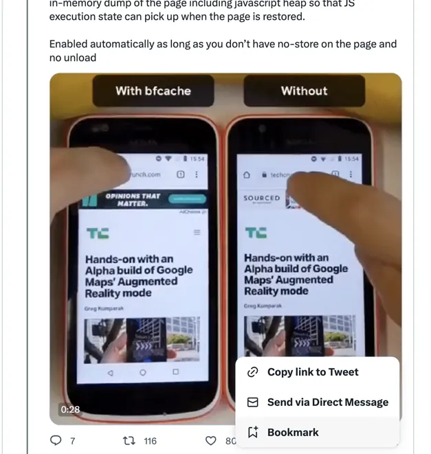
While increasing user engagement is vital, it is also crucial that too many push notifications don’t annoy web app users. One way of protecting users from being bombarded with notifications from the web app, and making the feature user-centric is to aggregate similar notifications as one notification on the client, Twitter was one of the first apps to do this using the ShowNotification() method of the Service worker.
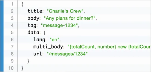
Whenever a notifiable event happens, the server sends a push which triggers the ShowNotification method on the client. Twitter used the message URL to tag, group, and count messages or retweets of the same type, i.e., related to the same conversation. Additionally, if a conversation is already open and focused, then the notification is suppressed.
In 2017, Twitter Lite was already delivering over 10M push notifications a day.
App Badging
App badging using the App Badging API allows apps to subtly notify the user when there is a new activity or to display a small piece of information, such as the unread count. This is possible through an application-wide badge shown at a specific location, like the dock or the home screen.
Badging of app icons was another feature added to Twitter Lite as it matured. If you have noticed the number of notifications being displayed along with the Twitter icon in the dock area of your device, it’s thanks to this API.

Launch Handler
This feature, available only with a few browsers, uses the Launch Handler API. The API lets app developers control how their app is launched, if it’s launched in an existing or a new window, and if it navigates to the launch URL. For Twitter users on desktop, this enabled quick access to features such as “New Tweet” or “Explore” via a menu that appears when you right-click the app icon in the dock.

Making the PWA Accessible
The Twitter PWA was developed to take Twitter to every type of device worldwide. But to enable every kind of user to use it, including the differently abled users, it had to be made accessible. Enabling digital accessibility (a11y) on a website requires conscientious efforts, so Twitter created a team dedicated to making the Twitter app accessible in 2020. The team was tasked with reviewing and building accessibility best practices within the app so that it could be used by people with disabilities. Technically, this required several changes to the code base, such as
- Manual focus management within Javascript to ensure that elements receive focus when displayed dynamically. For example, when a context menu is shown, the focus should lock within that. Similarly, the focus should return to the next logical element on the page when the menu is closed.

-
Creating keyboard shortcuts for accessing all of the significant features. For example, you can open a new tweet window by pressing n or retweet a tweet by pressing r.
-
Using accessible elements with ARIA, such as high contrast buttons instead of links.
-
The team built an autocomplete library - typeahead.js, to allow users to easily compose tweets.
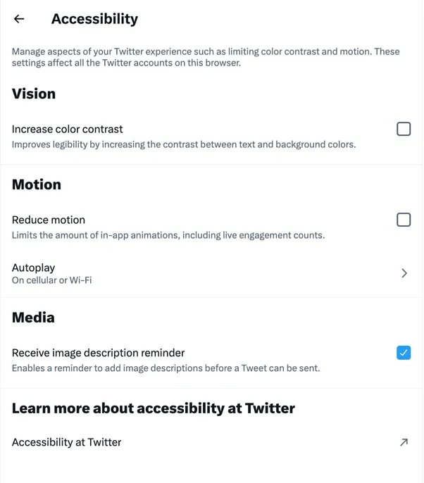
Users can manage advanced accessibility settings for color contrast, animations, and autoplay in the app to customize their experience.
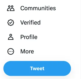
Here is what the Tweet button looks like with and without the high color contrast option.
| Increase color contrast = No | Increase color contrast = Yes |
|---|---|
 |  |
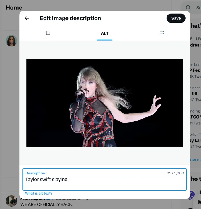
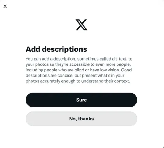
Along with the accessibility enhancements to the site itself, Twitter also encouraged users to post accessible content. An image description reminder told users to add helpful descriptions to their images before Tweeting them. The reminder can also be enabled in the accessibility settings.
| Adding an accessible description | Image description reminder |
|---|---|
 |  |

Twitter had even prototyped using the Text Detection API to help quickly and automatically extract the text from text-heavy images (like news story screenshots) as Alt Text.

Where did things land on real-world performance?
Looking at recent Chrome UX Report (CrUX) data for Twitter, we see that Time to First Byte (TTFB) and First Contentful Paint (FCP), and First Input Delay (FID) on desktops are good for more than 90% of the users, while FCP and FID are good on phones for more than 80% of the users.

While the Largest contentful paint (LCP) metric and the newly introduced Interaction to Next Paint (INP) metric need improvement on both phones and desktops, it is safe to say that the architectural decisions and performance improvements made since 2017 have largely withstood the test of time and subsequent changes.
Conclusion
Paul Armstrong, who was previously a senior software engineer/Tech Lead working on Twitter Lite, shared the following crucial perspectives on the performance improvement initiative in hindsight.
Making better performance a goal for the organization from the top down was the most crucial step. When teams and applications grow after the initial rollout, they lose the ability to spot potential performance pitfalls quickly before changes are rolled out. Eventually, there is a risk that performance becomes an afterthought. Therefore, It’s important to put metrics and reporting in place and ensure performance stays under budget. Observe, measure, analyze, modify, and repeat. If things seem slow, they often are. Measuring and analyzing shows where the bottlenecks are. Quantifying and understanding the impact of every change helps to check if we are moving closer to our performance goals.
The Twitter Lite story demonstrates the power of progressive web apps in expanding reach and improving user experience. At the time, Twitter Lite was the largest React.js-based PWA. Twitter Lite’s performance improvements enabled it to be fast, responsive, and accessible on all devices. When implementing features like lazy-load and service workers, the careful consideration of real-world conditions and management of network requests was instrumental to Twitter Lite’s success as a PWA. The implementation of features like installability and responsiveness allowed Twitter to reach users on low-end devices and unreliable connections while reducing data consumption. The PWA also allowed Twitter to build once and ship to everyone through a single codebase, providing a better Twitter experience overall.
Twitter Lite grew in availability and popularity by incorporating newer Web APIs like Storage Estimation and App badging. This makes it an excellent example of continuously leveraging the latest web technology to create accessible and efficient web experiences for users worldwide.
While we discussed the individual changes implemented, it’s important to remember that this case study is about assessing the technical barriers to change at any given time and overcoming them. The architecture and design decisions you take to improve any app will depend on the technology available at the time and organization-level support for the change. The takeaway is to find the best stack to help you build a PWA and combine it with a strategic roll-out plan that can maximize your reach across platforms and economies.
However, so far, there has been no need to rebuild Twitter. The Twitter PWA has lived with essentially the same code base for over eight years and, despite everything, is still one of the greatest, fastest, and most fully-featured PWAs. Why? According to Paul, the secret ingredient is not technical but human - ”I don’t think any of this would have come to fruition without an extremely excited team of smart and talented engineers with a passion to make something incredible.” Words that would undoubtedly make every person who worked on the Twitter PWA look back at their efforts with pride and nostalgia!
If you’d like to explore how the user interface of a platform like Twitter might be structured from a code perspective, there are some excellent open-source repositories that have done a notable job of replicating its functionality. While these aren’t exact code samples of Twitter’s original UI, they can offer valuable insights into building the UI of a similar platform. Check out ccrsxx/twitter-clone and RisingGeek/twitter-clone as starting points for your exploration.


